What to Wear for Family Photos: Dressing for Your Real Color Palette (Not Just the Season)
the colors that make you glow in every session
It's a question I think almost all of us wonder at some point: "What should I actually wear for this?" Myself included, even after nearly two decades around cameras. Every time a session is coming up, whether it's mine or someone else's, that same question shows up. So let's break it down.
Because the truth is, the calendar season and your color season are two completely different things. And once you understand the difference, outfit planning stops being stressful and starts being kind of fun.
The Assumption Most People Start With
Most of us were taught to dress for the occasion. Fall photos mean rust, olive and mustard. Holiday photos mean red and green. Beach photos mean white and tan. Spring photos mean pastels.
There's nothing wrong with any of that. But it puts the calendar in charge of your outfit instead of your own coloring. And when a color that's "supposed" to work for the season doesn't actually work for your skin, hair and eyes, it shows up in photos as dullness, washed out skin or shadows that seem to sit in the wrong places. You end up looking at your gallery and feeling like something is a little off, without being able to name what it is.
That's usually the moment worth pausing on personal color palettes.
What "True Summer," "True Winter" and the Rest Actually Mean
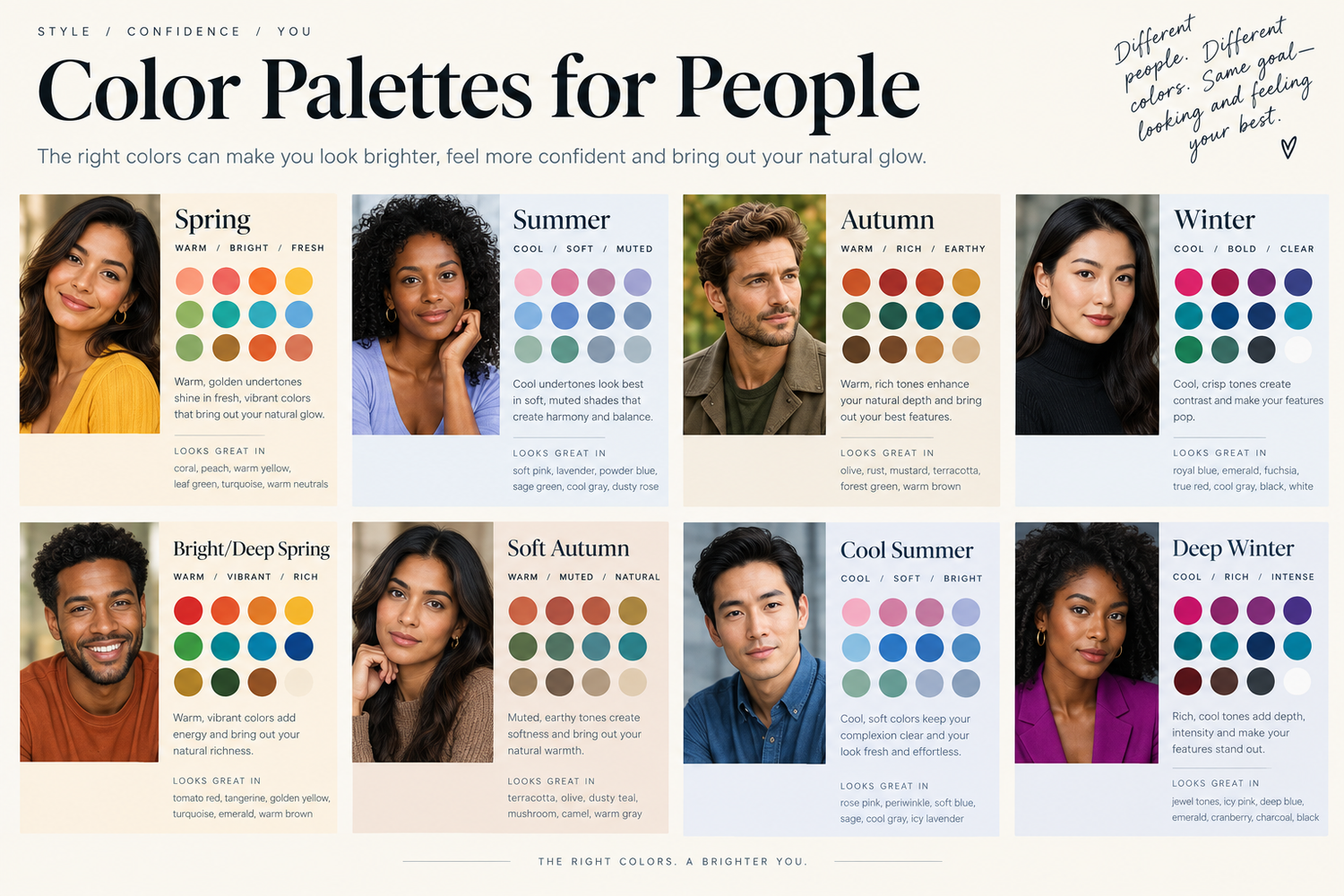
Personal color analysis sorts people into color families, most often called true summer, true winter, true spring and true autumn, based on your natural undertone and the amount of contrast between your skin, hair and eyes. It has nothing to do with what month it is. Someone can be a true winter and book their session in July, or a true autumn and shoot in the dead of January.
Here's the simplified version of each:
True Winter: Cool undertone, high contrast. Thrives in true white, black, icy pastels and clear jewel tones like emerald or sapphire.
True Summer: Cool undertone, softer contrast. Comes alive in dusty blue, lavender, soft rose and gentle grays. Muted rather than bold.
True Spring: Warm undertone, clear and bright. Looks best in coral, warm green, golden yellow and ivory rather than stark white.
True Autumn: Warm undertone, muted and earthy. Rust, olive, mustard, chocolate brown and warm camel are all home turf.
Most people land somewhere close to one of these four, even if a more detailed system would split them further into twelve sub-seasons. For the purposes of a photo session, the simple version is plenty.
Why This Matters So Much More in Photos Than in Everyday Life
You can get away with a color that's slightly wrong for you in daily life because the lighting is always changing and no one is staring at your face for more than a few seconds. A camera is a different story. Light bounces off whatever you're wearing and reflects directly onto your skin, especially near the collar and jawline. Put a true summer in a warm, saturated orange and that reflected light can add a muddy or sallow cast that's hard to edit out. Put that same person in dusty blue or soft rose, and their skin looks clean, their eyes look brighter and the whole image feels effortless.
This is the part I really want people to sit with. Dressing for your palette isn't about following a rule. It's about giving the camera the best possible version of your natural coloring to work with, so the photos actually look like you on your best day.
How to Get a Rough Idea of Your Palette Before Your Session
You don't need a professional color consultation to plan a great outfit. A few minutes in natural window light will tell you almost everything you need to know.
Hold something gold and something silver near your face. Most people notice one immediately warms them up while the other makes them look a bit tired. That's a strong clue toward warm (gold) or cool (silver) undertones.
Hold up a bright, clear color next to a muted, dustier version of that same color. True spring and true winter tend to favor the clear versions. True summer and true autumn tend to favor the muted ones.
Look at your eyes in a mirror while holding fabric near your collarbone. The right palette tends to make your eye color look more vivid rather than flat.
None of this has to be scientific. Think of it as an experiment rather than a test you can fail.
Ways to Go Deeper (If You Want To)
If the quick self-check has you curious to go further, there are some fun ways to explore it on your own time.
There are color analysis apps built specifically for this, where you upload a few photos and they'll walk you through which season you likely fall into based on your undertone and contrast. Pinterest is another great rabbit hole. Search "true summer color palette" or whichever season you suspect you are, and you'll find endless boards full of real outfit examples to save and reference.
Personally, I've done a bit of both. A colleague once did an actual fabric drape on me, holding different colored fabrics up against my face one at a time in natural light, and that's how I confirmed I'm a true summer. Out of curiosity, I later uploaded a naturally lit headshot of myself into an AI chatbot and simply asked it to help identify my coloring. It landed in the same place. If you want a second opinion on your own photo, that's a genuinely easy way to get one.
A Few Ideas for Each Season
True Winter: A crisp white button-down with navy or black, a deep berry sweater, or a jewel-toned dress in emerald or sapphire.
True Summer: Dusty blue denim, soft rose or mauve, muted lavender, or a soft gray knit layered with white.
True Spring: Warm ivory instead of stark white, coral or peach, golden mustard in small doses, or a clear grass green.
True Autumn: Rust, olive, warm camel, chocolate brown, or a deep golden yellow.
In every case, the goal isn't to match your outfit to the season on the calendar. It's to borrow the hue and depth that already flatters you, and let that lead the way regardless of what month we're shooting in.
Let Yourself Have a Little Fun With It
Color is the biggest piece of this, but it's not the only one. One of the things that elevates a gallery the most is choosing something a little more special than what you'd wear on an ordinary Tuesday. That doesn't mean dressing unlike yourself. Honestly, it's the opposite. Lean into whatever already feels like you: a favorite pattern, a piece with some texture or movement to it, a color you love but rarely reach for out loud, or even a small theme that means something to your family. The goal isn't to look like someone else for a day. It's to let a slightly elevated, maybe even a little playful choice help the photos feel like the occasion they are.
Coordinating a Family or Group Without Everyone Matching
This is where it gets more interesting for families, because it's rare for everyone in a group to share the same color season. My favorite approach is to pick a shared palette of three or four versatile, muted tones that work across warm and cool undertones (think soft denim, cream, and a warm neutral like camel or taupe), then let each person bring in one small "pop" color from their own best palette through an accessory, a cardigan or a pair of shoes. Everyone looks pulled together, and everyone still looks like the best version of themselves.
Frequently Asked Questions
Do I need a professional color analysis before my session? Not at all. A quick experiment with fabric near your face in natural light will get you most of the way there, and a color analysis app, a Pinterest search or even an AI chatbot can help confirm it if you're curious. It's never required to have a beautiful gallery.
What if the occasion calls for a color that isn't in my palette? You can usually find a version of that color within your own undertone and contrast level. A true summer wanting a holiday red can lean into a soft berry or rose instead of a true, bright red, and still feel festive.
Do kids and toddlers have a color season too? Technically yes, but for little ones I care much more about comfort, ease of movement and something they'll actually keep on for the whole session. If a color happens to flatter them too, that's a bonus.
Can I mix seasons within one outfit? Sometimes, especially with neutrals. A true autumn in warm camel can still wear a crisp white, for example. The goal is a look that feels put together and true to you, not a strict rulebook.
This Isn't Just Useful for Photos
Here's the part I love most about this whole exercise. Once you know your undertone and which hues genuinely bring you to life in front of a camera, that knowledge doesn't stay behind at the session. It tends to change how you shop, how you get dressed on an ordinary morning and even how you feel looking in the mirror. What starts as prep for a photoshoot has a way of turning into a small, lasting shift in how you get dressed every single day.
Let's Plan Your Session Together
Outfit planning is one of my favorite parts of getting ready for a session, whether that means playing with color palettes, picking something a little special, or just talking through what feels right for your family.
Ready to plan a session in Knoxville, Maryville or anywhere else in East Tennessee? Let's talk about your outfits and your story before we ever pick up the camera.
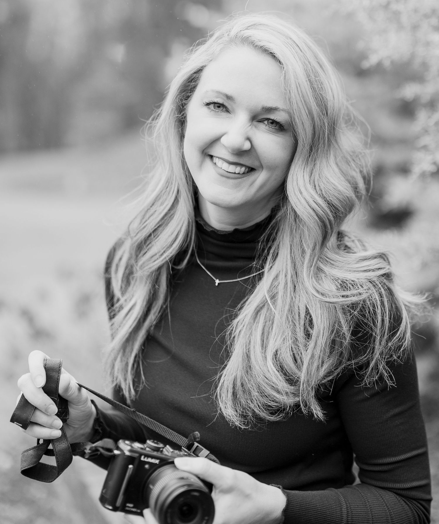
About Brookney Chamberlain | Hux & Mae Photo
Hi, I'm Brookney Chamberlain, the photographer behind Hux & Mae Photo, a family and lifestyle photography business serving Maryville, Knoxville, Kingsport, Johnson City, and East Tennessee. I bring a relaxed, warm approach to every session, welcoming real, everyday moments rather than posing them away. From family sessions and milestone photography to portraits, couples sessions, and imaginative "Imagine" sessions, every image is edited with clean, natural tones for a timeless feel. Photos for real life.
Interested in a session? Get in touch here or explore more of my work.